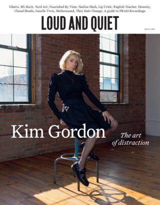
Art critic Clive La Bouche reviews your album sleeve suggestions
They are not good

They are not good
A couple of weeks ago Loud And Quiet wised up to Facebook groups and created once called Loud And Quiet – Inside the Magic. They’ve said – and I believe them – that it’s a place of community where DIY music fans can promote and support one another’s projects, keeping the group open so anyone can post whatever they like there. I jumped on this, and not only because they asked me to post something. What a great way to connect with fellow lovers of ART, I thought, as I invited the 10s of people on the group to post the album sleeves they’d like me to write a hot take on.
If you read the physical edition of Loud And Quiet you’ll no doubt have agreed with my monthly column on a regular basis – a column that the editors seem unwilling to post here on the site, despite EVERYTHING else from the mag making the cut – but if you’re new to me, I’m Clive. I love album art. It a passion that has always been in me. If it’s IN you too, poke me on the Facebook group.
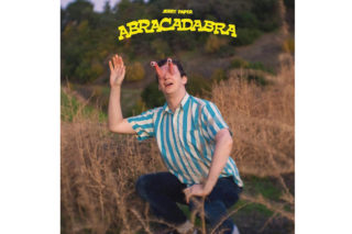
Abracadabra by Jerry Paper
There used to be 3 myths that, even in a pre-internet age, made it to every single school in the UK: 1.) The best friend in the Wonder Years grew up to be Marilyn Manson. 2.) The Chuckle Brothers were not brothers at all – Barry was Paul’s dad. 3.) If you sneeze with your eyes open, they will pop out. The second one scared me the most, but here Jerry Paper has lived out the third whilst squatting on a wasteland in a darts shirt. Personally, whilst I understand it (Paper is clearly satirising modern self-surveillance in a society of heighten paranoia), I can’t say I care for its resemblance to Jar Jar Binks. It actually makes me feel quite queasy – 10% because of the Jar Jar eyes, 10% that wave, 80% his squat, made all the more sinister due to his trousers being on. I don’t think I’d get the tour T with this on, let’s put it that way.
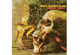
Undying Thirst by Black Market Brass
When this one popped up in the feed I thought, ahh, what have we here from 1989? A cult metal band from a time where you didn’t have to choose skull OR snake; they came as a pair. Was I a little surprised to find out that this record was released one month ago? Yes, I was. And I thought there wasn’t really much to say about it until I clocked the reading glasses, bottom left. So what’s happened here? Man dies, say, 100 years ago? His head’s fallen off, which will happen during that time. (Maybe the rest of his body is just out of shot.) There’s an outsider chance that his head has landed the right way up on the floor. It’s not likely, but fine. The wind could have blown the glasses off – it’s been 100 years, don’t forget – or, most likely, they slipped off when his nose rotted away. That’s just science. But HOW has a rusty pipe coming out of a wall ended up in his mouth? Try it at home using your own head (still attached) and a breadstick – the angles just don’t add up. You’d have to slide your head along the floor towards the pipe/breadstick. For puzzle factor alone, this piece of album art is delivering big. Yes, I would bye the tour T of it.
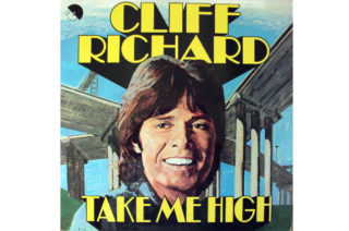
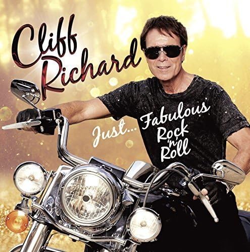
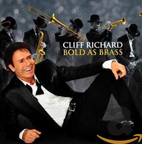
Take Me High by Cliff Richard
Cliff Richard does not make bad artwork. See? See? Seeee? Granted, it might not be your cup of tea, but for his fans, aged between 69 and dead, his cavalier refusal to dress his age gives him just enough edge without the need for coarse language or texting without the proper use of grammar. Take Me High, I found out 30 seconds ago, was Cliff’s final feature film and accompanying soundtrack. There’s not much information about the film online, which isn’t a great sign. Its Wikipedia page simply says that it’s set in Birmingham, refusing to confirm or deny if its title is a reference to either dogging on Spaghetti Junction or smoking a doobie, or both. Could this be Cliff’s naughty rated 12 movie that none of his fans have been waiting for? This cover, a little off for the master of artwork, is similarly vague. Just like “a film set in Birmingham starring Cliff Richard” suggests, it says, “a Cliff Richard record, take it or leave it”. Great! I’ll leave it thank you.
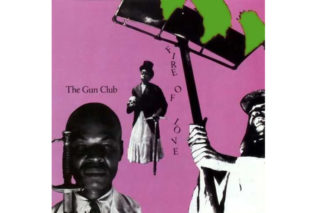
Fire of Love by The Gun Club
In 2020 you could make this album sleeve by sitting on your phone. And in the right areas of South London it’d be considered genius. When the Gun Club made it in 1981 – and I’m guessing this number a little bit – it took 132 hours to make and they still couldn’t work out how to remove the green bits. It’s completely terrible, but don’t think I don’t know that that’s exactly what makes it brilliant.
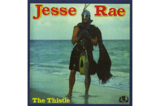
The Thistle by Jesse Rae
Whoever Jesse Rae is/was and whatever he is/was selling, I’m buying/have bought it. He doesn’t need the picture of the thistle in the corner (it feels a bit condescending, actually, Jesse), and the Beano font is a bit off, but… c’mon, you don’t need me to tell you that this sleeve simply works, just as you don’t need Andrew Graham Dixon to tell you that the Mona Lisa has something to it, or Dion Dublin to tell you that first time project manager Roy should think about moving the kitchen sink out of the bedroom cupboard.

